Amazon - Best of Year

How might let the user celebrate the uniqueness of their every year?

End of 2026 (expected)


As we learn more about our users and are able to curator smarter pairings of photos, the team is working on more personalized photo memories to tell unique stories for each user.

I am owning the visual design of our revamped memory templates across the mobile app, FireTV, and Echo Show.


End of 2026 (expected)

As we learn more about our users and are able to curator smarter pairings of photos, the team is working on more personalized photo memories to tell unique stories for each user.

I am owning the visual design of our revamped memory templates across the mobile app, FireTV, and Echo Show.

Impact

  • Rebuilt the visual narrative so 6M+ users could relive their memories, not just watch them

  • Rebuilt the visual narrative so 6M+ users could relive their memories, not just watch them

  • Worked side-by-side with backend and frontend eng to make the layouts scalable and responsive for different account sizes, whether 10 or 10,000+ photos

  • Designed experiences across 3 distinct surface, optimizing for each tech stack and context, while holding the system together

CASE STUDY

CASE STUDY

Best of Year

Best of Year

How can we up level the current experience to validate and celebrate every customer’s unique identity?

December 2026

THE PROBLEM

THE PROBLEM

The most-played memories feel like
no one's

Memories should be highly emotional, and personal artifacts that resonate with each and every customer. Currently, Amazon Photos' biggest, most-watched memory experiences — Best of Year (6M plays in 2025) and Best of Season (4.26M plays). Yet, they feel impersonal, so almost no one shares them. Share rates are ~3.85% and ~3.65%, the lowest of any memory type, despite being the most-played.


Memories should be highly emotional, and personal artifacts that resonate with each and every customer. Currently, Amazon Photos' biggest, most-watched memory experiences — Best of Year (6M plays in 2025) and Best of Season (4.26M plays). Yet, they feel impersonal, so almost no one shares them. Share rates are ~3.85% and ~3.65%, the lowest of any memory type, despite being the most-played.


  • Photos have no storyline connecting them: Selection is based on quality and temporal distribution, with no personal information displayed

  • Every photo is displayed the same way: Single photos shown one after another with no collages, framed photos, or varied layouts

  • Customers could not share individual photos: Until 2026, customers could only share the entire memory, limiting their ability to connect with different people over specific moments.  

THE APPROACH

THE APPROACH

How might we design a memory that feels made for each user?

The new, redesigned Best of Year would feature new visuals and an revamped backend curation model. This would allow us to create personalized modules – Top People, Places, Celebrations, Best Moments and "Stats" – that would improve the storytelling of a user's year.


The design needed to be scalable, yet feel personal to each user. I wrote these design principles to guide decisions throughout the process to make sure we were resolving the tensions of the current experience:


In order to help make users make informed decisions, it was important to understand what they find valuable. After compiling past user research, the top user need is to balance control and ease.

  1. Celebration, Not Product Showcase: Feel recognizable as our brand, but visually distinct from in-app UI

  1. Personalization Integrated, Not Centered: We wanted to reward users who invest in their library, without punishing customers who haven't.


  1. Every screen it's own artifact: Let every screen tell a complete story and create its own connections – putting the user's photos at the spotlight.

DECISION 1

Visual Direction

The first thing Product, Design and Marketing had to align on was the visual direction. I put together a range of options, drawing inspiration from editorial examples and other "Wrapped" experiences.


The first thing Product, Design and Marketing had to align on was the visual direction. I put together a range of options, drawing inspiration from editorial examples and other "Wrapped" experiences.


Based on these, I created some varying proposals for our visual direction, recommending #4. What I noticed across other experiences was that bold typography and intentional framing of each photo served as a way to create brand presence while making each screen feel like a stand-alone artifact – our design principles 1 and 3 respectively. I brought leadership along with this reasoning and got alignment on the recommended direction.


Based on these, I created some varying proposals for our visual direction, recommending #4. What I noticed across other experiences was that bold typography and intentional framing of each photo served as a way to create brand presence while making each screen feel like a stand-alone artifact – our design principles 1 and 3 respectively. I brought leadership along with this reasoning and got alignment on the recommended direction.

DECISION 2

Photos-first templates

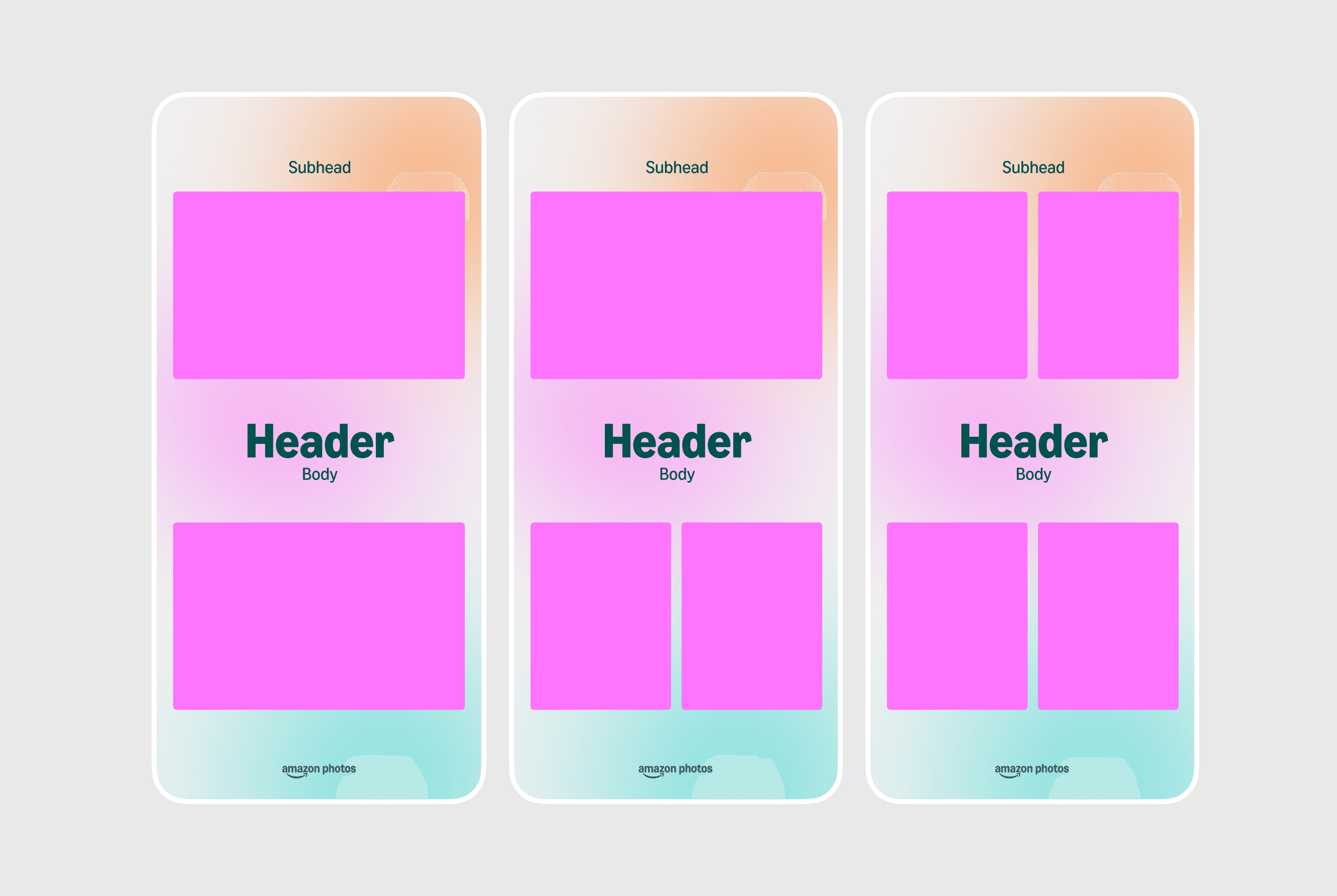
After deciding on the design direction, the next round of iterations focused on creating templates for each module (People, Places, Moments etc..). I experimented with different editorial styles and layouts. However, unlike a magazine or a graphic poster, these designs are framing real user photos.


  • A true camera roll may not have perfectly staged moments; the last thing we'd want to do is crop a loved one's face out of the frame.

  • Additionally, I whenever possible, I decided to prioritize edge-to-edge layouts that would create immersive experiences with user photos.


After deciding on the design direction, the next round of iterations focused on creating templates for each module (People, Places, Moments etc..). I experimented with different editorial styles and layouts. However, unlike a magazine or a graphic poster, these designs are framing real user photos.

A true camera roll may not have perfectly staged moments; the last thing we'd want to do is crop a loved one's face out of the frame.

Additionally, I whenever possible, I decided to prioritize edge-to-edge layouts that would create immersive experiences with user photos.

DECISION 3

Scalable templates

Following design principle 2, another key factor when designing the templates was considering account sizes. Creating layouts that only favored large account sizes (> 500 photos) would create underwhelming experiences for smaller account sizes (<100 photos). Some examples of iterations following this principle include:


  • Iterating on trip layouts that could show multiple photos, but did not depend on number of photos for a good experience


Following design principle 2, another key factor when designing the templates was considering account sizes. Creating layouts that only favored large account sizes (> 500 photos) would create underwhelming experiences for smaller account sizes (<100 photos). Some examples of iterations following this principle include:

  • Iterating on trip layouts that could show multiple photos, but did not depend on number of photos for a good experience


  • Creating photo layouts that could easily scale based on the min. and max. number of photos per module defined with Product and Engg


  • Suggesting randomized background color selection in the backend, rather than per-module color. For example, if all People modules were yellow, Trips blue and so forth, a user without any trip data would get a memory full of only yellow cards


  • Creating photo layouts that could easily scale based on the min. and max. number of photos per module defined with Product and Engg


  • Suggesting randomized background color selection in the backend, rather than per-module color. For example, if all People modules were yellow, Trips blue and so forth, a user without any trip data would get a memory full of only yellow cards

DESIGN SUPPORT

Thorough documentation and QA

Given the visual craft of each screen, the specs I handed off to engineering were highly detailed, and I am following through with hands-on design QA.


Given the visual craft of each screen, the specs I handed off to engineering were highly detailed, and I am following through with hands-on design QA.

THE IMPACT

THE IMPACT

Best of Year

Best of Year

How can we up level the current experience to validate and celebrate every customer’s unique identity?

December 2026


This experience is actively being built and targeting a launch by the end of the year. While we don't have quantitative data yet, we have early signals from Beta testing and user research sessions that are promising, as well as additional details to continue to improve the designs.


— "I would definitely send these people collages to my loved ones"


— "The stacking photos was a good touch, it felt very interactive"


— "I'd like to see the dates on my collages because I forget when photos were taken"


This experience is actively being built and targeting a launch by the end of the year. While we don't have quantitative data yet, we have early signals from Beta testing and user research sessions that are promising, as well as additional details to continue to improve the designs.

— "I would definitely send these people collages to my loved ones"

— "The stacking photos was a good touch, it felt very interactive"

— "I'd like to see the dates on my collages because I forget when photos were taken"

Scaling across surfaces

Collages on Echo Show and FireTV

November 2025, April 2026


While the mobile experience has not yet launched, I also led the visual design of new, curated experiences for our Echo Show and FireTV customers as well.


Given these experiences are tailored for ambient, lean-back viewing, they prioritized letting the photos shine. Design and UI elements were minimized and instead the real-estate was fully dedicated to the photos.


Additionally, the designs supported the qualities of each surface. Echo Shows are more digital and "smart" by nature, while the newly launched FireTV – Ember Artline – was intended to be an artful frame TV.

In order to help make users make informed decisions, it was important to understand what they find valuable. After compiling past user research, the top user need is to balance control and ease.

UP NEXT

Photos in Alexa FTUE

Photos in Alexa FTUE